
Logos
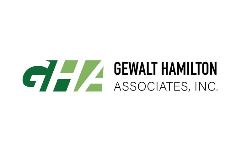
GHA Inc. Logo Concept
This project was developed as a proactive concept study to explore a modernized visual identity for GHA. While the firm ultimately elected to retain its heritage branding, the exercise served as a successful deep-dive into balancing contemporary aesthetics with the professional legacy of a long-standing engineering firm. This conceptual work highlights my ability to research and refresh established brands through independent initiative.
NAI Hiffman
This motion identity prototype was developed for NAI Hiffman to explore how their established corporate brand could be translated into high-impact video and digital environments. The project focused on creating a sophisticated, secondary animation asset that maintains the firm’s professional authority while adding a modern, dynamic layer to their visual toolkit. It serves as a proof-of-concept for internal stakeholders on the future of the brand's digital presence.

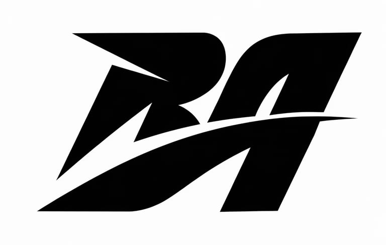
Old identity
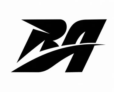
This 'BA' monogram served as the primary mark during the early stages of my design career, focusing on sharp, aggressive geometry and athletic-inspired motion. The project was a deep dive into vector precision, utilizing high-contrast negative space to create a sense of speed and impact. While my personal branding eventually shifted toward a more character-driven fox-head motif, this piece remains a favorite example of the bold, technical style that defined my first few years in the industry.
Newer personal logo (Animated version)
You can find my current logo on the homepage, but to exercise my Adobe Flash and After Effects skills, I've taken it to the animation stage and got experiemental with it for other personal projects,

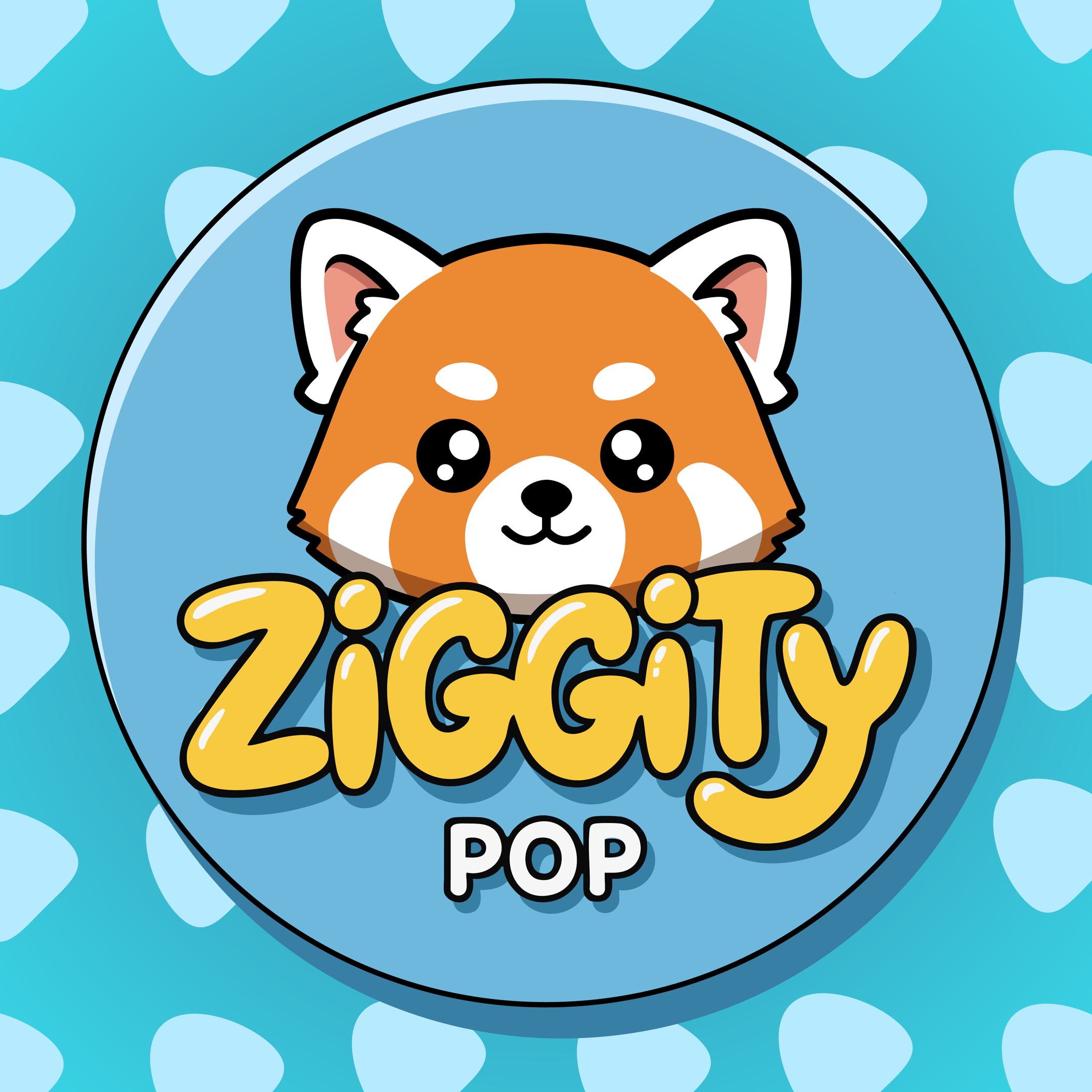
Ziggity Pop
As a side hobby I've taken on youtube with some AI video knowledge and started an educational channel for kids. It's in the begining stages and we'll see where it goes. But for the channel's idenity, I wanted something playful, colorful and pops out with a cute mascot to capture kid's attention. You can find the channel here - https://www.youtube.com/@ZiggityPop0
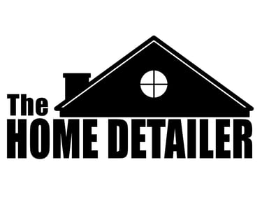
The Home Detailer
This identity was developed for a local home services business, focusing on immediate brand recognition and a sense of domestic reliability. I designed the silhouette to be bold and easily legible from a distance—ideal for vehicle wraps and lawn signage—while utilizing a classic chimney and window motif to anchor the brand in the home improvement space. It’s a project that demonstrates my ability to create functional, high-contrast branding that translates effectively across physical media for a small business audience.

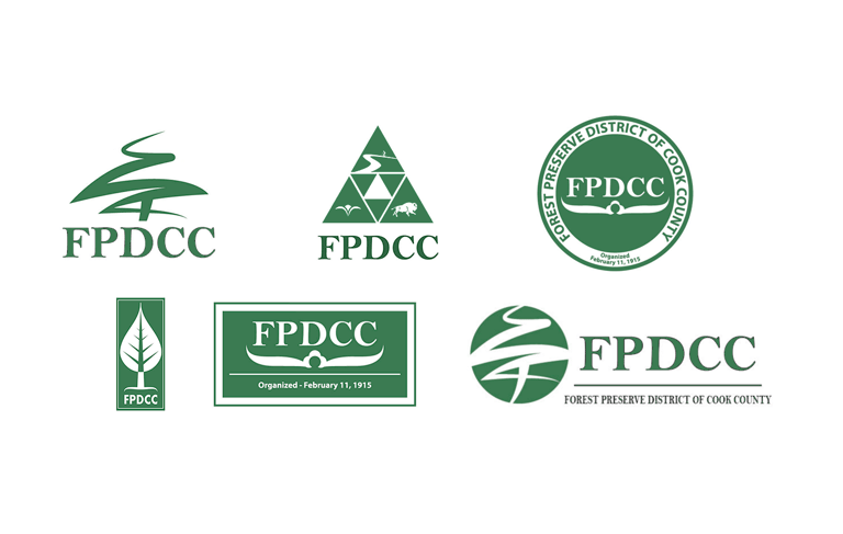
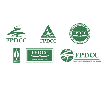
FPDCC Logo
This series of brand concepts was developed as a creative exploration for the Forest Preserve District of Cook County to investigate how their historic identity could be modernized for a new generation of visitors. The project focused on distilling the district's core elements—nature, conservation, and community heritage—into various geometric and organic forms that could work across diverse touchpoints from trail signage to digital media.
Bill Alexander Portfolio
Showcasing my graphic design work for clients.
CONTACT
© 2025. All rights reserved.